


On the Edge of Something Greater than Before
On the Edge of Something Greater than Before
Starting new projects, plus all the links and inspo to finish up September

I’m currently writing this in my apartment wearing denim jeans and a Devendra Banhart sweatshirt mostly accepting the fact that fall is officially upon us. The days of wearing cutoffs and loose fitting button-ups have been replaced with slacks and a t-shirt covered by chore coat on top. Sartorially, it’s a time to be enjoyed, because once it gets cold cold, you’ll find me wearing thermals under all my clothes, as I’m a total wimp when it comes to the cold. This is something I’ve really only discovered since moving here, and that Kyle, the man who perpetually wears shorts in the winter, teases me about. It’s hard out here for a Californian who spent half their life in Los Angeles having to adapt to real cold weather in and around Europe.
An upside to fall is that everyone is back in Barcelona. The holidays are over and my social calendar is filling up again, with dinners at old favorites, drinks at bars I’ve never tried, and more events happening around town. In fact, Kyle and I have started planning our own monthly event in order to build some community and meet more people like us. It’s a very “if you build it they will come” energy. We did events in our old apartment a lot, which some of you definitely attended, or I even did things like a pop-up bistro with my buddy Nate, as an attempt to do something new and different. My Chani horoscope says, “Get ready for a flurry of heart-eyed emojis in your text threads, meet-cutes at the local coffee shop, and calls to justice on the neighborhood corkboard.” I’m keeping this in mind.
If you have any interesting, creative friends (who aren’t in tech, sorry) please send me a note and introduce me, or if you happen to know of a great space here in Barcelona to host a casual meet and greet event, hook it up — thefoxisblack@gmail.com
Hope you have a lovely week 💙 If you need me you can find me here.
Art —
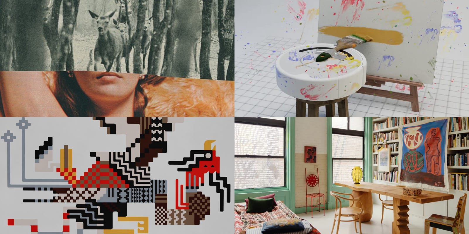
→ I was reorganizing the books in my library and came across the inaugural issue of Inque Magazine which featured a striking piece from Belgian artist Katrien De Blauwer. She intriguingly describes herself as a “photographer without a camera” though technically I feel she’s a collage artist, collecting random photos and old magazines and bringing together the pieces through dynamic cuts, bold color combinations, and grainy textures. Her pieces are moody and evocative, telling stories akin to fine art comic strips.
→ Ted Chiang, perhaps one of the best writers of contemporary science fiction, wrote a piece titled Why A.I. Isn’t Going to Make Art, which does a great job of looking at the current landscape of digital tools and why they, for now, are not a risk to those making art, which I personally agree with.
Generative A.I. appeals to people who think they can express themselves in a medium without actually working in that medium. But the creators of traditional novels, paintings, and films are drawn to those art forms because they see the unique expressive potential that each medium affords. It is their eagerness to take full advantage of those potentialities that makes their work satisfying, whether as entertainment or as art.
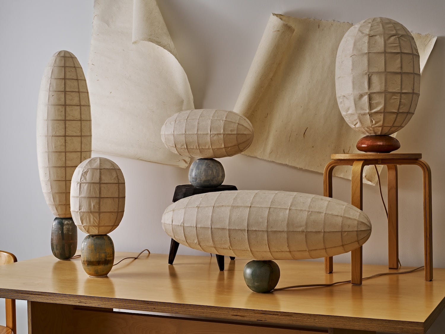
→ Perhaps embodying a craftier, more honest version of Noguchi’s Akari lamps, New York City-based designer Steffany Trần has released a collection of lamps under the name Rễ Cây, which combines a hand-thrown porcelain base with large Dó paper lampshades. The contrast, in both size and materials, is striking, and brings a contemporary point of view to traditional materials. My personal favorite is the lamp in the front, with the little green apple base and the massive, airship-esque shade.
→ The Conference of the Birds is a Persian poem by Sufi poet Farid ud-Din Attar, where the birds of the world searching for their true leader — the legendary Simurgh — under the guidance of the Hud-Hud. In the end, only 30 birds reach the final destination, only to discover that they themselves are the Simurgh. Si meaning 30, and murgh meaning bird — 30 birds in Farsi. Artist Mustaali Raj was inspired by this poem, and created this beautiful concept for a mural depicting the birds. It somewhat reminds me of the mosaic Charley Harper did in the Cincinnati in the John Weld Peck Federal Building.
→ If you’re anything like me you love a good home tour and this walkthrough of curator Alex Tieghi-Walker’s home/gallery in Manhattan is a good one. I like that he’s kept the space sort of rough and ready with nods to it’s former life as a factory, and the amount of light the space gets is totally enviable. Plus it has to be wonderful to be surrounded by so many phenomenal pieces of art in the day-to-day. It’s been fascinating to watch him go from a crazy farmhouse in Berkeley, to this beautiful home he had in Echo Park, to this new space in New York.
Design —
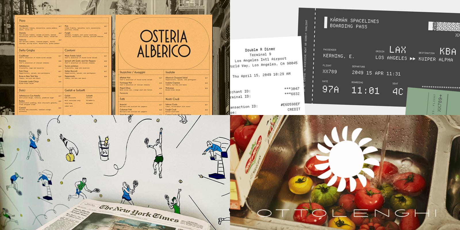
→ There are times when you see a brand identity and you think, “yeah, that makes perfect sense,” and that’s exactly what Studio Mast did with Osteria Alberico, encapsulate the feeling of an old-timey restaurant through timeless typography and iconography. Drawing on a myriad of Italian signs, fonts, and colors, the resulting identity threads the needle of classic and contemporary. I’m especially fond of those big O’s in the logo, as well as the “A” mark that’s created from the name of the restaurant. Lots of smart choices here done simply and well.
→ It’s genuinely exciting to come across interesting website experiences in 2024 and I was delighted to scroll through this site for the font Departure Mono. Departure is a free monospace font created by Helena Zhang and the site was created by Tobias Fried and honestly, it’s like a short journey you get to explore, with a surprise ending that kept me entertained for a good 10 minutes. Super work all around.
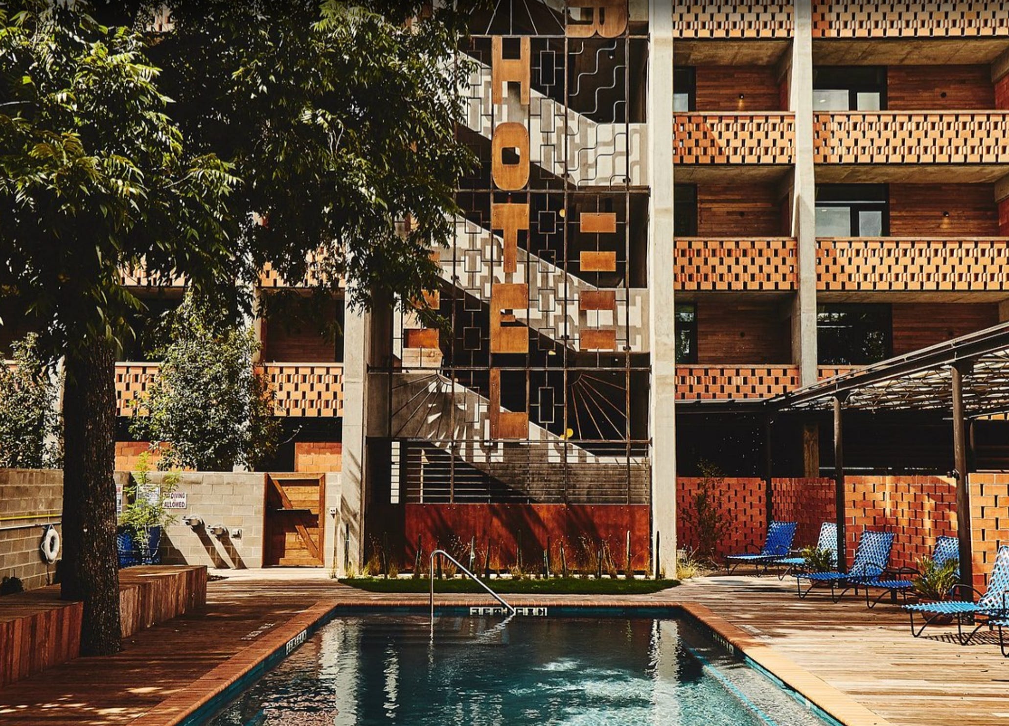
→ You may not have heard of LAND but they’re probably one of the most influential “design agencies” out there, though that description is a bit limiting for the scope of work they produce. They recently redesigned their website to be a truer archive of their work, showcasing projects like the expansive universe they created for Madre Mezcal, the experience that is The Carpenter Hotel, as well as the iconic packaging design they did for Mountian Valley and Stumptown Coffee. Their work brings me so much joy, everything feels so special, and few design agencies bring this level of craft and taste to their work.
→ There is swag, and then there’s genuinely interesting items created for event that actually have a sense of uniqueness to them. I would put Rob Wilson’s illustrations for the New York Times suite at the U.S. Open in the latter category as it’s completely charmed me. Working in partnership with the T Brand Studio, they created a beautiful scarf, a cutie little hat, as well as a full wallpaper featuring Rob’s iconic illustrations that capture moments you would see at the event.
→ Ottolenghi, the brand, not the man, got a rebrand, and man, it’s good. The new identity was created by Irving & Co. (who as it turns out, is one man, Julian Roberts) who’s created a rather cute, long-boy logo, making an already long brand name into an even longer logo, going in the opposite direction of what I think would normally be done. They’ve also leaned into this really beautiful red as the primary color of the brand, reminiscent of a deeply stewed tomato paste. Deliciously done.
Food —
→ While I was in Marseille I frequently visited Sarment, a very cool wine bar that was around the corner from where I was staying. One night on the menu we saw “pastèque rôtie” which translates to roasted watermelon, and I was so confused, so we ordered it. What came out looked like tuna steaks, and then I was even more confused, so we asked the waitress, and sure enough, baked watermelon is totally a thing. I had no idea, and maybe you didn’t either, I was shocked! Please make this at home and let me know if it’s easy to do.
→ I love martinis, as dangerous as they can be, but then I saw this TikTok from Daisy, an editor at Infatuation London, who put together her guide of Silly Little Martinis, which is basically a mini-martini you sip while you figure out what you want to order. They’re cheap, they’re strong, and they help get the night kicked off on the right foot.
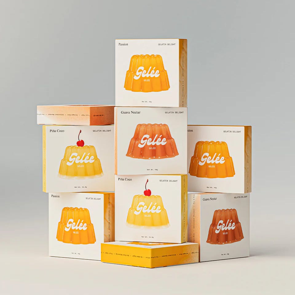
→ Everything old is new again so of course we now have Gelée, a fresh take on the classic Jell-O. Gelée comes in three flavors, a guava nectar, a passionfruit, and a pineapple coconut, all of which sound good to me, plus they sell moulds to make cute shapes, reminiscent of the types of jellos you’d see in old magazines from the 50s and 60s. I do love the packaging, very simple and cute.
→ I’m lowkey obsessed with Cycene, the restaurant at Blue Mountain School, And I’ve had this cocktail bookmarked for so long which I meant to make during the summer but now it’s going to be a fall cocktail. They called it a Burnt Lemonade, where they take Meyer Lemons and char them, giving “an aromatic floral undertone, crisp and reminiscent of sherbet.” I’m sold.
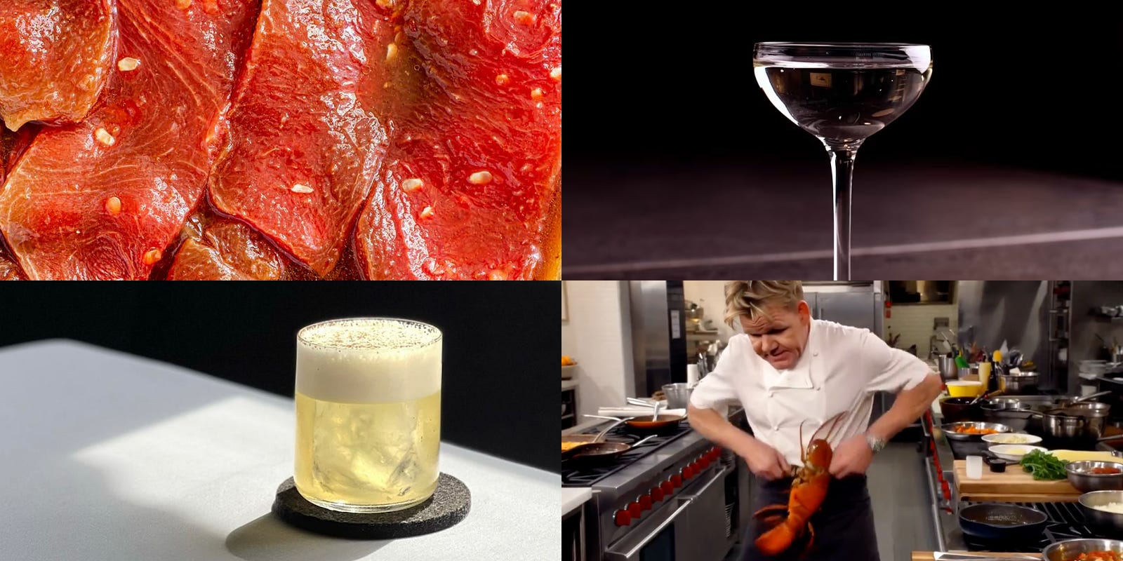
→ AI is bad and annoying BUT I do love when people make the most brain-melting videos because they are silly and entertaining. For example, Justine Moore has created a “Gordon Ramsey AI cooking series” which is perhaps one of most insane and hysterical things I’ve ever seen, portraying the surly chef shirtless stirring a pot of water smoking a cigarette, seemingly catching fire while barking orders in a kitchen, and opening a lobster with his bare hands, and that’s only 30 seconds in.
Architecture & Interiors —
→ What do you get if you combine natural wine, arts and crafts, and a Japanese listening bar? You get Goodbye Horses, with gorgeous interiors designed by Swiss architect Leopold Banchini and hand-painted murals by artist Lucy Stein. The space to me looks like a ye olde timey pub but with modern twists, like a a 4,000-plus vinyl record library and restored Tannoy Lancaster speakers. Why aren’t there more bars like this near to me!
→ I’ve been a fan of Clare V. since she first opened her store in Silver Lake and I love that she’s been able to continue to design after all these years. So I was excited to see that Domino did a feature on her 1905 craftsmen home that’s only a short walk from her shop. The home is more traditional than I expected, though it feels quite airy and vibrant, with unexpected pops of color and bold patterns here and there. Related, she has a new collaboration with Schoolhouse and it’s funny to see the products styled in her home.
→ If you choose to name your cafe Superfreak you should probably have a space that matches said freak, correct? YSG Studios did not disappoint, creating a space that feels distinctively 70s, complete with carpet covered bar stools and banquette, cork flooring, buttery yellow walls, and eclectic tchotchkes. It’s wild to me that this combination of elements works so well but that’s why you hire people with fantastic taste to create unique spaces for people to enjoy.
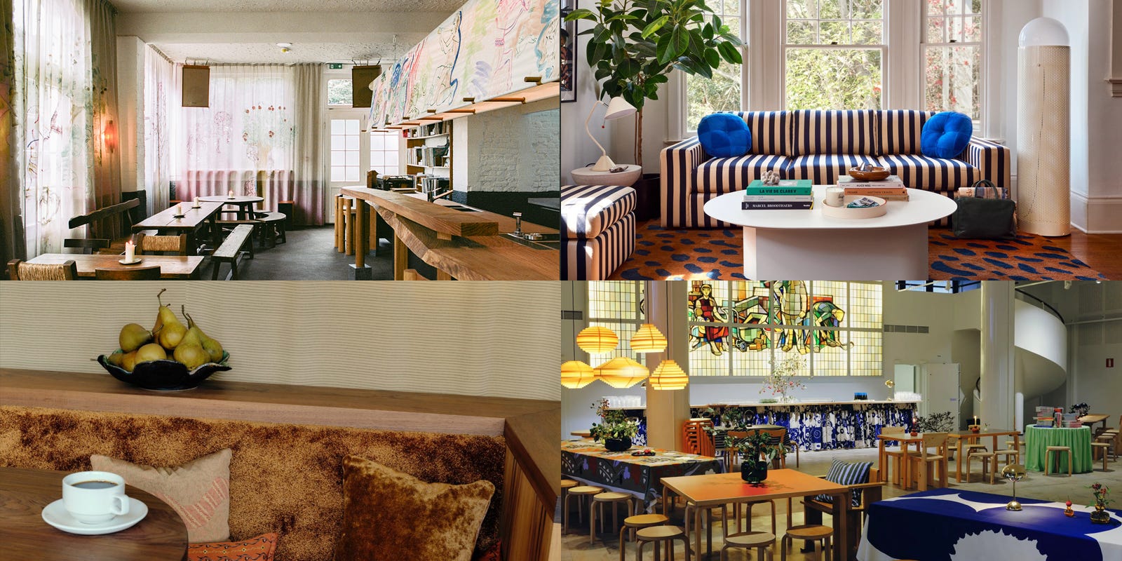
→ I wrote about Bar Unikko back in April, the collaboration between Marimekko and Apartamento magazine in Milan, and it was such a success they did it again for Helsinki Design Week. This most recent version was set in a historic former bank hall and furnished with Nordic design pieces, giant flower cushions, and floral prints everywhere including the curtains, tapestries on the windows, and even the outfits of the servers. I feel like this space, as well as the outdoor terrace, was such a vibe.
Oh, Katrien De Blauwer is wonderful. My platonic ideal of a collage has maybe 3 elements, and she excels at that kind of really thoughtful visual consideration. I originally found her via Daniel Benneworth-Gray, who's also a fan.
https://meanwhile.substack.com/