


Helium Flash
The joy of an iPad Mini, London recommendations, seductive photography, branding inspired by "lucid dreaming", and gingerbread Paimon

Last week, I decided to reevaluate my hardware workflow after seeing several videos on YouTube speaking about how much they enjoyed the new iPad Mini. Years ago, I had a Mini that I loved, specifically for the ergonomics. In my mind, the iPad Mini fits that Goldilocks space between a MacBook and an iPhone, it’s just right. I decided to buy one to utilize as my daily browsing device, and so far, it’s exceeded my expectations.
The 6th gen iPad Mini weighs only 0.65 lbs, which is impressive considering my iPhone 13 Pro weighs 0.45 lbs, and the Mini’s screen is roughly the same surface area as three iPhones. Reading, watching videos, browsing Tumblr or Are.na, changing the music on Sonos, studying Spanish on Duolingo, checking the weather… these things feel so seamless on the Mini, especially when it’s propped up on your body or being held by both hands. The iPhone 13 Pro is too big and unwieldy to hold in one hand, and the only reason I bought it was to take high-quality photos and edit them in VSCO.
So my day-to-day consists of this new Mini paired with a 13-inch MacBook Pro with an M1 (which I love, for it’s form factor and weight, coming in at a mere 3 lbs). My writing, emailing, and designing primarily happens on the MacBook, and all researching and browsing on the Mini. So far, I’m loving this set-up, and I’m really happy I made this purchase, and I’m excited to see what other ways it can help me in my day-to-day.
Additionally, I’ll be traveling to London with Kyle and the dogs from 14-21 December, and would love to meetup if folks are free. I have a pretty decent map of places to visit though additional recommendations are always appreciated. Drop your tips and tricks in the comments!
Hope you’re well 💙
💭 — There’s something exceedingly compelling in the surreal and vibrant photos of Zhong Lin. Looking through her photos, she gives me this 90’s music vibe, lots of contrast, tons of bright color, and a point of view that is dramatic and highly editorial. The words “seductive” and “dangerous” come to mind. I can’t get enough of her work, I’m looking forward to the day she gets a massive coffee table book so I can soak in the all the details.
💭 — You have to give credit to A24 for their uncanny knack at creating merch. Their books are beyond, oftentimes employing designers like Actual Source to really elevate the look and feel. What really takes the cake for me is their Hereditary Ginger Bread Treehouse Kit. The film, for me, is in the top ten of all horror movies, and the fact that they’ve created a full blown kit, including a cast iron mold plate, which let’s you make a gingerbread Peter, Paimon, and worshippers, is beyond. It’s beyond!
💭 — I remember when folks first started talking about magazines on iPads, and how it was absolutely going to be the future and the downfall of print (lol). It wasn’t until recently that I read Design Threads, which describes itself as “a collaborative report unraveling the state of design today.” The project is a collaboration between PORTO ROCHA and Float, who’ve effectively created a beautiful “magazine” with chapters such as ‘Tyranny of Taste’ and ‘Excess of Everything.’ I’ve been reading these chapters at night and it’s so well executed and genuinely interesting. It’s also really fun to read on my iPad Mini, just saying…

💭 — “Lucid dreaming” seem like an interesting space to find inspiration for a brand design though that’s just what andstudio has done. Their client, Gretes, was looking to move toward cellulose based silk and away from traditional silk as the process uses a lot of resources. So they decided to change materials and their brand, creating a new vision for the company while still maintaining their clientele. andstudio employed bright, dreamy colors and attributes of nature like light on a summer day and rippling sun rays. The whole redesign is a total joy, I’m fond of how they mixed the type styles in the logo and how the letters flow together so nicely.
💭 — Wait, you still use fire to light your candles? How primitive! The Infra Luna is cheeky collaboration between Byredo and French light artist Benoit Lalloz, which utilizes an LED heating mechanism to… “light” your candles. The whole contraption has a very luxe, cocaine chic feeling to me, a bit over-the-top in the best ways. Sadly, you won’t be able to spend that $2500 you had lying around for funsies as the Infra Luna is sold out, womp womp…
💭 — It’s that time of year when you need to figure out your calendar for next year, even though it’s still this year. I spotted that Margaret Howell had released a calendar celebrating the history and work of plywood furniture company Isokon. the calendar features a selection of twelve archive photographs of Isokon furniture and the Lawn Road Flats (now known as the Isokon Building). Quite simple and clear without being boring.

💭 — I just picked up this new book published by apartamento on the life and works of Miguel Milá, ‘A Life In Design.’ I was familiar with Milá’s work because of his Cesta lamp, which you see above, which is produced by Santa & Cole. It was exciting to find out that he’s 91 and still working. And for the past 60 years or so his work have helped shape Spanish design in so many ways, from park benches to fireplaces, and even an umbrella stand that doubles as an ashtray. If you’re a fan of modernist design, this is a must read.
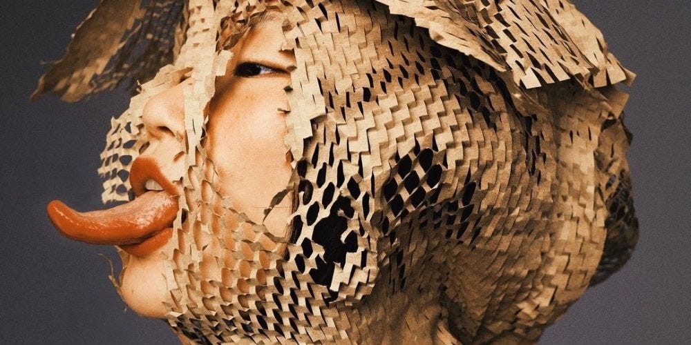
💭 — Design studio Look has created one of my favorite campaigns of the year for Off-White’s launch of their beauty line, PAPERWORK. The photos, which to me are phenomenal pieces of art, were done by my fave Bobby Doherty. I think it’s interesting that in most of the photos, the bottles are the only reflective element, while everything has a diffused, sort of matte appearance, highlighting them in the assemblages. Adding the backgrounds to add an illusion of depth was a really nice touch as well.

You must must must go to the Chris Killip show at The Photographers’ Gallery.