It Doesn't Matter What They Say It's the Way We Feel
Quality over quantity, rejoining Insta, and highly curated list of the things you need to see
It feels very human to try and find a rhythm. Or perhaps, more accurately, changing one’s rhythm to adapt to the situations we find ourselves in. Uptempo or downtempo, muted or expressive, there is no one rhythm that can carry us through all experiences. For me, and for this newsletter, I came to a realization that I could no longer curate a list of interesting and thoughtful creative items each and every week, something which many of you know me for. This is for a couple reasons.
The first is focusing on quality over quantity, which I’ll be the first to admit, has not been my strategy. Often, I’ve found myself scrounging for things to share, desperate to come across anything that ignites even the smallest spark to fill a self-imposed quota. I’ve struggled over the past couple years to find creative projects that really connect with me, especially related to graphic design, which, may simply be a shift in my personal interests. Most branding or identity these days feel so same same, and not to be overly dramatic, but more like products being churned out for the sake of capitalism, with no risks and no innovation happening. Plus, everyone seems to be a “curator” these days, stringing together a few links and a couple pretty images, yet lacking any real opinion or POV as to why these things are important. So, I’ve decided to squirrel away the best of the best and share the creative projects and ideas I loved at the end of each month, which is what you’ll find in today’s newsletter.
Second, due in part to my recent resurgence in reading (three books in August so far, soon to be four, I’m currently reading Stay True ↑) I’m inspired to focus more on creative writing. I’ve really found a lot of joy in spending more time on my storytelling which feels like I’m flexing a muscle I’d somehow forgotten about. My brain is wired to constantly notice things, and in this past month I’ve started writing those little things down. Like the number of times I’ve seen French people randomly start singing together in public spaces. And sometimes, those little ideas become larger stories, and so, I do my best to figure out an interesting way to tie all those things together. It feels similar to the way I design, a lot of problem solving, taking pieces and parts and making something unexpected.
Finally, tying back to my brain constantly noticing, I’ve rejoined Instagram as a means to share my love of photography, keep up with friends, and be inspired by interesting people. Feel free to follow me over there if you’re curious about what I’m seeing in my day-to-day life. I’ll be posting in the OG way, lots of single images, a smattering of food and dog photos, recommendations for books or art shows, rarely any Stories or Reels. And quickly, a hello to the flurry of new subscribers who found me last week! Welcome to The Fox Is Black, hope you have a lovely week.
If you need me you can find me here 💙
Design —
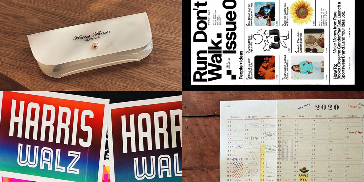
→ Designer JP Flexner has created his own series of Harris/Walz campaign signs that are done in a Colby Posters style, and honestly, it works really well! I like that he created his own typefaces for these which give them a classic electoral feeling. I can safely say that these are leagues better than the horrific poster Shepard Fairey made. That’s not how mouths look!
→ Alex Hunting Studio is most well-known for being the creative spirit behind Kinfolk magazine, so it was nice to see them change lanes for their newest project, a free zine called Run Don’t Walk. Described as being about ‘the people moving themselves and their communities forward,’ the compact editorial is a fresh take on a classic format with topics ranging from natural wine, rare book dealing, equity in sports, to community radio. Are zines making a comeback? Did they ever go away? Inspiring, nonetheless!
→ When I first arrived in Marseille, Kyle and I would go for long walks to explore the neighborhoods around us. On one of these walks, I came across Focus Focus, a high end optical shop with beautiful interiors and spot on branding made by edition.studio. The logo looks to me like the unholy union between the Ford Motors logo and a scatter plot chart, which I mean as a compliment. Really nice work, especially with how the logo animates.
→ I wish I had more room for Postalco’s 2025 wall calendar (ignore the fact that the image above says 2020, it’s the same design!). There’s something so charming about having a record of your year at the end of it, looking back and seeing all that was done and all that was accomplished. I love printed matter but I’m so bad at using it!
→ When I think of skateboarding my mind goes to the world of Tony Hawk or old CKY videos. I was pleasantly surprised to come across Haraka Baraka, a boldly designed book created as a pro-bono collaboration between SkatePal, who supports young people in Palestine through skateboarding, and Pentagram partner Samar Maakaroun.
The design embraces play above all else, an approach that deliberately runs counter to many people’s expectations or assumptions about the Arabic language—routinely associated with religion and politics. Accompanying each of the final 22 phrases featured is an original, type-led illustration, which takes its visual cues from the meaning behind the phrase.
→ Rarely do I ever wear a graphic tee, like, literally only this Bianca Saunders Griddle tee, but this Brâncuși shirt from Hato Press is so silly that I think it’s great. Romanian sculptor gang, where you at?
→ The Washington Metropolitan Area Transit Authority (WMATA) is the public transportation agency operating rail and bus service in the Washington D.C. metropolitan area and the folks at Order has created a digital signage system to support the existing wayfinding throughout the WMATA network, providing tools to communicate arrival times, real-time service updates, up-to-date transfers, and more.
I copy and pasted all of the above because my goodness what a massive undertaking for a design studio to take on! The scope of this sort of design system has to be exhausting, it seems like something I would have wanted to take on when I was 25. Huge props to Order and the other agencies involved. Projects like these are incredibly important even if they’re not the sexiest work.
Architecture & Interiors —
→ How does one furnish a spacecraft? This feels like the brief that Norm Architects when they were given the brief for the interiors of Iris, the restaurant inside of Norway’s Salmon Eye experience. Since the Salmon Eye’s design is quite amorphous and covered in shining, silver panels, it makes to contrast the design with earthy, walnut furniture, plush taupe carpeting, and warm lighting provided by Santa & Cole Babel lamps. The space is still quite brutalist in tone, though you do get a sense of possibly relaxing and enjoying a meal, along with the breathtaking view.
→ The folks at Akin Atelier have brought the world of City Pop to life in their newest project, a bar called JAM Record Bar, located in Sydney. Doused in a medicinal pink and doused in wam under lighting, the space is a glowing homage to Japanese listening bars. The space plays host to a rotating list of nightly DJs and the Japanese-inspired menu looks delish’.
→ A while back my friend Dan introduced me to Stòffa, the well-regarded New York menswear brand who is becoming well known for their timeless silhouettes. Earlier this year they opened a new flagship store in Soho, a calm, inviting space that feels like an artists atelier, while still maintaining a strong sense of luxury.
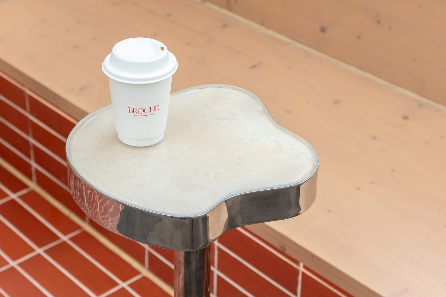
→ Reclaimed corners of unwanted space in an urban canvas is a particular interest of mine as I love the problem solving aspect of making something improbable, possible. That is certainly the case with Broche Coffee Shop, which takes an unused corner in the city of Oxford and transforms it into a cozy cafe. I’m not going to say that this is the most exciting bit of design out there though I am impressed by the ingenuity.
→ In the moment it can be challenging to recognize whether something is trendy or timeless. And though I may like something now, will it weather the test of time? That’s the feeling I get viewing El Fant, a cafe and bar located in Helsinki and designed by Yatofu Creatives. The team “aimed to showcase young Finnish craft in an honest and contemporary manner” while collaborating with two local studios, one for the pine furniture, the other for the metal work, which are meant to create a “harmonious clash of juxtaposing materials.” I will say, I love the look of polished stainless steel, it’s have such a big moment right now, and the massive, red-stained pine table is quite a dramatic piece for the space, I find it to be quite stunning.
→ Close your eyes and imagine a bridge. Do you see a shining, metallic structure, circular in shape with a hole in the center, cradled between two buildings while hovering above a small one-way road? If you did, go buy a lottery ticket. If not, let me show you Tondo, a footbridge that connects two government buildings in the heart of Brussels. From the outside the bridge resembles some kind of optical illusion or a spaceship parked illegally, while on the inside, the peculiar shape lends itself to happenstance meetings.
Photography & Art —
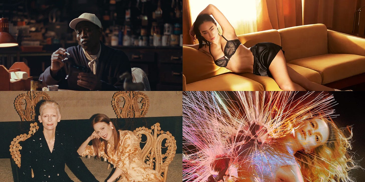
→ I’m indifferent to celebrity spokespersons, though, when a brand gets it right, it can create a cultural moment. First, we have Wesley Snipes for Kith, who seems to be the embodiment of unbothered, moisturized, happy, and in his lane, while also looking incredibly stylish in their Fall 2024 collection. What works is that it’s all unexpected, the pairing of the two and the world of the video and photoshoots. No one saw this coming. The second moment we have to talk about is Greta Lee for Calvin Klein. Jesus christ on a plastic sign is she sexy. She’s an Academy Award and Golden Globe nominee, as well as a Loewe muse, who was already reaching IT girl status and now she’s the Marky Mark of our time. This image is personally my favorite. The confidence, the slicked back hair, everyone wants to be Greta.
→ Tilda Swinton and Juliane Moore are two of the most iconic actors and their about to appear in a new Pedro Almodóvar film together called The Room Next Door and so to publicize the film they all appeared in Vogue Spain and the results are phenomenal. It’s important to call out Quentin De Briey who’s photos feel incredibly glamorous and high fashion while also capturing the incredible spirit of these creatives.
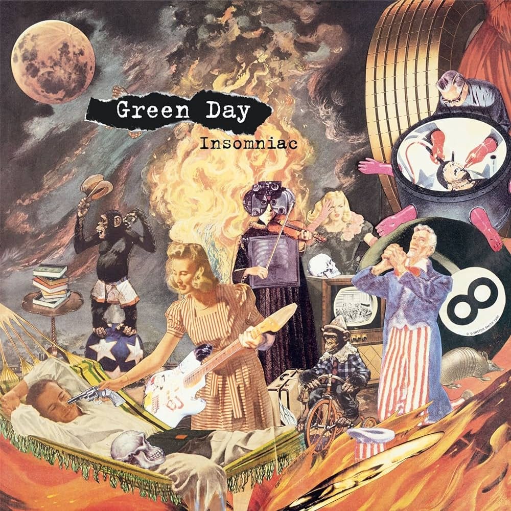
→ The other day I was remarking that Green Day’s album Dookie was the first CD had I ever bought, and it lead me down a Wikipedia worm hole which reminded me of how great the artwork was for their album Insomniac. I then learned that the collage on the cover was the work of artist Winston Smith and the title of the piece is the quite charming, God Told Me to Skin You Alive. All in all it took him two weeks to source all the pieces for the collage and then he worked 38 hours straight to create it, claiming, "It's easy for me. I'm an insomniac."
→ One of the most exhilarating artists of the moment, Elizaveta Porodina creates photos that seem to radiate pure energy. Unfortunately, I couldn’t much, if any, information about her though the work on her Instagram speaks volumes. Through digital manipulation or perhaps witchcraft she creates photos that looks like you mixed 80s maximalism and 1920s surrealist art to create a fantastic new genre.
Music —
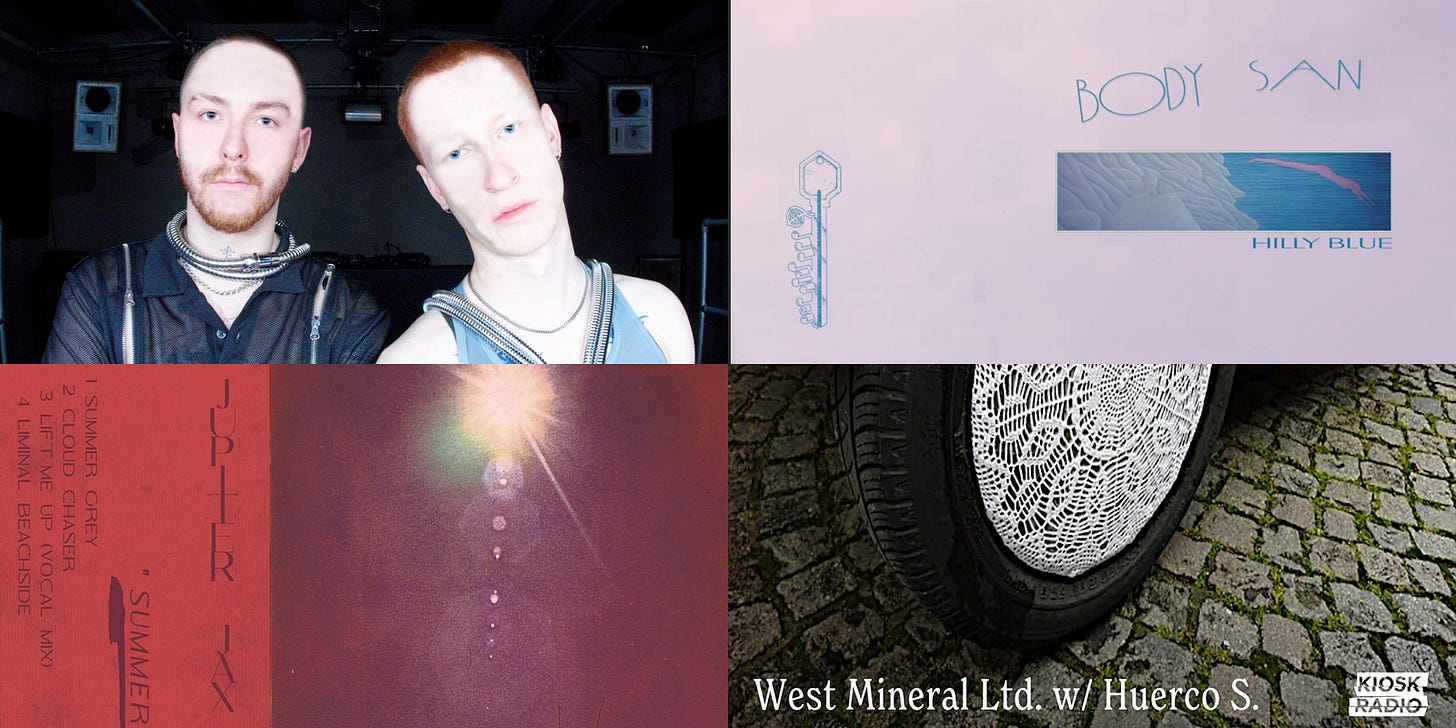
→ The boys behind the chopped and screwed electronic music act Two Shell decided to come out of… no, I won’t too easy. But they did decide to open up in an interview with Mixmag claiming “we’re tired of hiding it’s totally messing up our algorithm too. face to camera is what it’s all about.” Fair enough. If you haven’t listened to their first Icons EP it’s a classic, and then listen to The Cover Mix they put together, 90 minutes of nonstop energy. A theme you’ll see through a lot of the things I’m recommending is the term “pop deconstruction” which is becoming incredibly popular in electronic music.
→ Huerco S. is having a nice moment with lots of interesting releases. A couple weeks back he dropped a new mix on Kiosk Radio which starts with the most beautiful pop deconstruction of Julio Iglesias’ “Pobre Diablo” by innerinnerlife and then descends into a rambling, bubbling melange of songs. Then he also dropped a new album under his moniker Loidis titled One Day which is more of a classic techno record that goes perfect for when you need to focus or let your mind wander.
→ Charli XCX is finally getting her moment in print, though in my opinion, they’ve all missed the moment. There’s the Vogue Australia article, which has one of the saddest photo shoots on earth, and now have a cover story for New York Mag by Brock Colyar and some very over-the-top photos by David LaChapelle. It’s a really well-written piece and it’s phenomenal to see Charli living in the moment, or as she says, “The kids get to decide when it’s over.” It’s all larger than her now: “This is a ‘sit back and watch it burn’ situation for me.”
→ Miami-based producer and artist Nick León has a new show on NTS called Beach Noir and the first episode was a treat. They describe it as “musical postcards from London back to Miami shores filled with sun, salt and melancholy. Nick shares the music that has influenced his upcoming album as well as highlighting Miami musical moments in the realm of ambient, idm and all things murky.” Highly recommended.
→ Two more recommendations I’ve really been enjoying: Hilly Blue by Body-San, which has been described as a “grab bag of hot steppers and house wreckers” and Summer Grey by Jupiter Jax, representing “rhythms and melodies cruise and crisscross, brooding and blissed along Mediterranean shores. It’s music of lost hours and fleeting farewells, dusted with the glow of endless sunsets.”
The Trend Report™ by my partner, Kyle Raymond Fitzpatrick, is a sharp and insightful look at all the things going on in the world, arriving every Sunday to your inbox. Highly recommended, obviously.





Bobby is *heallling* - welcome back to IG!