


Liminal Beachside
Visiting Marseille, mild rebrands, safety pin glasses, cozy decor and more

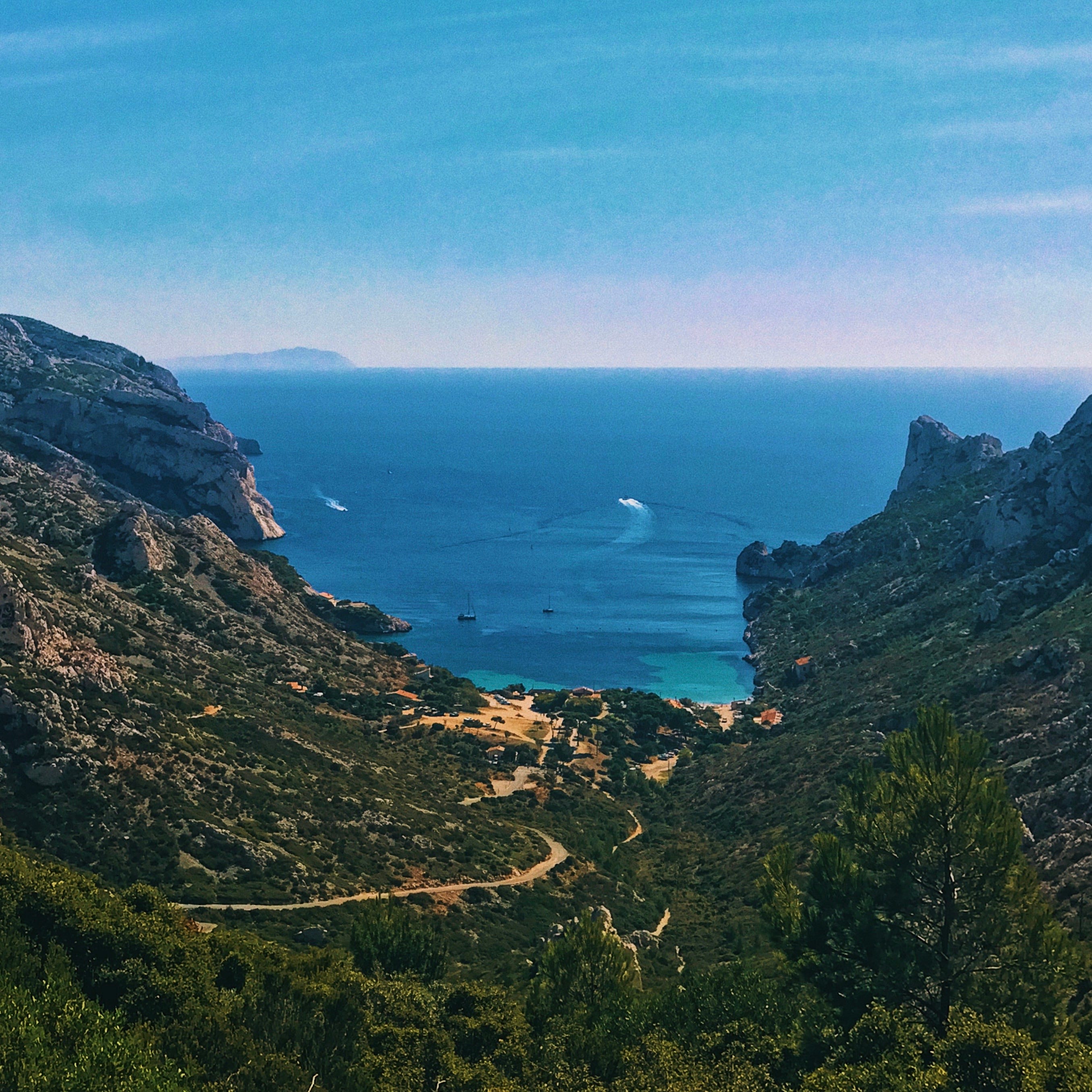
I’m very excited as this week I’m packing up the family and heading off to Marseille for the month of August. This is mainly to avoid the insane humidity of Barcelona, something I’m still not acclimated to, though admittedly, the weather has been rather temperate compared to previous years. A lot fewer outfit changes due to being a sweaty mess!
Last year we stayed in San Sebastián as we wanted to explore more of Spain. This year it’s Marseille as it felt appropriate to go with more of a French flavor. It’s been almost exactly 5 years since my last visit to Marseille, Paris’ kid sister, who lies in the south France on the Mediterranean. I’ve read so much about Marseille’s up-and-coming glow up so I’m excited to see what’s changed since my last visit. I already have plans to drink lots of great natural wine, eat all the fruits de mer, and try out all the different soap flavors. I’ve even looked into pottery classes while I’m there. I’m very much looking forward to a change of scenery and to see what it feels like to live in France for a bit.
If you have any recommendations for Marseille, or any other towns that are easily accessible by train, please send them my way! Or If you happen to be in the area, hit me up, we’ll grab a glass of bubbly and a dozen oysters 💙

☠️ — Last week, Landor announced a new brand identity for plastic container brand (not sure what to call them lol) Tupperware, and I had to critique the work because sadly I found it so boring. I can hear it now, “Get this! The top of the T is opening like Tupperware, isn’t that great?!” Using the concept of lids and containers is definitely a territory to explore but… this isn’t better than the old logo! Seeing work like this is why I’m over branding and design. It’s dressing up capitalism to try to be interesting and there’s nothing exciting about a plastic container brand, sorry. Funny enough, the work has been entirely wiped from the Landor website and all their social! I’m so curious what the tea is here, why did the work come down?! If you google search “landor tupperware” you can see the rest, which again, is all very vanilla. Additionally, it’s important to say that I’m assuming this is mostly the clients fault, as projects like these tend to be neutered by clueless execs 😓
💻 — If you need an amazing social campaign designed there’s no better agency in all of Los Angeles (and maybe the industry!) than Watson. I worked with them a lot at Disney and it was always incredible to see what they’d come up with. Plus, they’re literally the nicest, most chill people ever. They have a new website and it’s so impressive scrolling through all the work they’ve done, they make brands look way cooler than they really are.

😎 — Did you know H.R. Giger created a pair of safety pin sunglasses? I had no idea till I saw this floating around Twitter. I love this photo, he looks like such a diva, maybe vacationing in Ibiza in the 70s. These sunglasses are so rad, I could easily see Gentle Monster do a reissue, but if you told me this diva was the creator of the Alien critters, I wouldn’t believe you!
🐊 — Is everyone getting in on the Crocs collab game? Now French running brand SATISFY® has a new Crocs out, the Quick Trail, a clog for off-roading (or grabbing your morning coffee). If I went hiking in these I know I would get all kinds of pebbles and dirt in those holes on the top, it would suuucckkk.

🦪 — I’ve been slowly building an archive of imagery as inspiration for my future café so that I have a clear vision of how I want to look and feel. The number one thing is good light/lighting, there is nothing more important to me. Second though is making a space that feels like someone’s home. Random tchotchkes, knick knacks, a bit of bric-a-brac, you know, items that tell a story. I came across these images of Sullivan’s Fish Camp (great name!) and it embodies these elements in such a beautiful way. Developed by SDCO and Basic Projects, they describe the space as "Some details feel modern, some nostalgic. Experienced together, guests can't be sure if it's 1982 or 2024." Literally a perfect approach, I’m obsessed.
☕️ — Related, The Brand Identity spoke with Studio Temp Founder Guido Daminelli about the team’s work on Caffé Rimowa, which I’m pretty sure I shared before. He describes the space as "being transported into the past, but in a futuristic way” which I agree, this is an apt way to describe the space. Their use of red is so eye-catching, and the aluminum mixed with the wood makes for such a unique space design.

🔠 — I’m really enjoying the typography and abstract lettering that Pedro De Sousa has been cooking up. A Lisbon-based designer, Pedro’s work is type-focused which is often paired with physical prints and marks that create a tactile mood to everything he makes. I highly recommend checking out BARRA, his experimental monospaced typeface (I need it!) and the work he did for MMXXII ORIGINS SS 24 (love me some printed matter).
😴 — Ok, I’ll fess up, I have a blanket addiction. I personally have bought nearly a dozen or more blankets for our very small apartment. That said, you probably have a tan or dark blue couch and you need a nice blanket to add some pizzazz. Currently, Commune has a beautiful selection of Gregory Parkinson blankets that are sourced from India. The colors are gorgeous and the patterns are interesting, these are beautiful investments.
Just when I'm demoralised by my inbox being full of sales emails your ray of sunshine hits. Love all the links and insights this edition. (How cool is are safety-pin sunglasses - OMG!) Thank you. x
Marseille is the best, it surprised me how much I loved it 2 years ago - so much that I was back again last year!
Favorites:
Regain, one of the greatest dinners I've ever had in France
Ourea for dinner
Le Vin Sur la Main and Ripaille for wine and bites
Jogging for lunch and shopping next door - their property 20 min south of the city in Samena is also amazing. Felt so special spending a few nights there near the calanques
Releve for drinks