Run Towards the Goal Not Away from Your Fears
Daily tapestries, scribbly drawings, mindful wandering and much more
Spring is here! It happened so quickly, almost comically so from a timing perspective, though I couldn’t be more grateful. The weather is still in flux here in Barcelona though we’ve already spotted a hen party or two, which is effectively our groundhog equivalent. I’m excited to start traveling again, trips to the beach, down to Sitges, out to Menorca, and in August, Marseille. I really can’t wait to get a tan again, I miss the feeling of the sun on my skin as I listen to the sounds of the sea. Sigh, in time!
Hope your week is great, I hope you enjoy this weeks curation 💙
Solid identity work for Ventura Foreman by the folks over at Studio Blackburn. A type-driven approach that’s fairly straightforward in it’s approach yet the simplicity and negative space really gives the brand such a pleasant vibe. It was a smart choice to use Dinamo’s Marfa as the typeface, it brings a little quirk and weirdness. The unique color palette of the labels also work really well to give some charm without too much personality.
Jesse Mordine Young created a “tapestry drawing” every single day of 2023 and the resulting works are gorgeous. I’ve never before seen the idea of a small tapestry as a sketch, or seeing something in life and making a tapestry from what the artist has experienced. Someone needs to let her exhibit these works in their entirety, I know I would love pouring over all the details.
Loving the illustration work for Darren Shaddick, a North Devon, UK artist who’s scribbly, expressionist style is so off and weird that they’re wonderful. Artists like Darren are so special because they’re style is so organic, or perhaps even chaotic, that it’s impossible to replicate their style. Everything is so loose and free and gestural, it’s wonderful.
Super fascinated by the concept behind TERRA, dubbed as “a companion for mindful wandering.” It’s essentially a handheld device that begins with a prompt, such as “two-hour Marais stroll with patisserie visit,” and the AI translates your intentions, available time, and precise location into a tailored trail of GPS coordinates. It’s basically wandering and living life without your phone, but also, no worries about getting lost.
Tom Robin is a fantastic designer and creative director based in New York, and I recently came across these typefaces he made, Ucka, Aber Mono, and Schabo X Condensed, which are super interesting and free. You have to do a bit of digging to find the download links but it’s worth the time. Thanks Tom!
Ugmonk and J. Stark collaborated on a limited line of multi-pocketed tote bags and I’m here for them. I find that I never have enough pockets in my day-to-day bags and these look like they would have literally a pocket for anything I can think of. They’re made of heavy duty twill with durable leather straps and come in a black on black or olive and tan color combos. Beautiful, timeless designs made well will always be in style.
I’m definitely intrigued by a new player in the digital radio space called ROVR, describing itself as “a new-generation music discovery platform featuring a 24/7 worldwide broadcast of outstanding music selections by a special crew of international curators." I’m a big fan of NTS and their programming so I’m curious to see how ROVR stacks up.
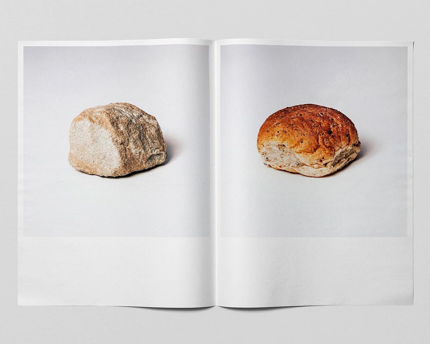
Rock & Roll comes to life in this tongue-and-cheek exploration from Christopher Doyle & Co in their new publication. It’s so dumb I had to include this in today’s round-up. If you happen to be in the Sydney area, drop Chris a line and you can pick up a free copy from the studio.
Beautifully gothic flower arrangements — Volcanic vortex rings — Rasmus Pettersen’s glassy, obfuscating cover of 1984 — Puzzle-like business cards — LA landmarks by Zack Rosebrugh — Björk recording Homogenic in a house in El Cortijo, Spain — I Went To Your “Award Winning Creative Agency” And Nobody Knew You


