Your Drug Is a Heartbreaker
Talking about how fall is here 😓 and a look at my process designing a book cover
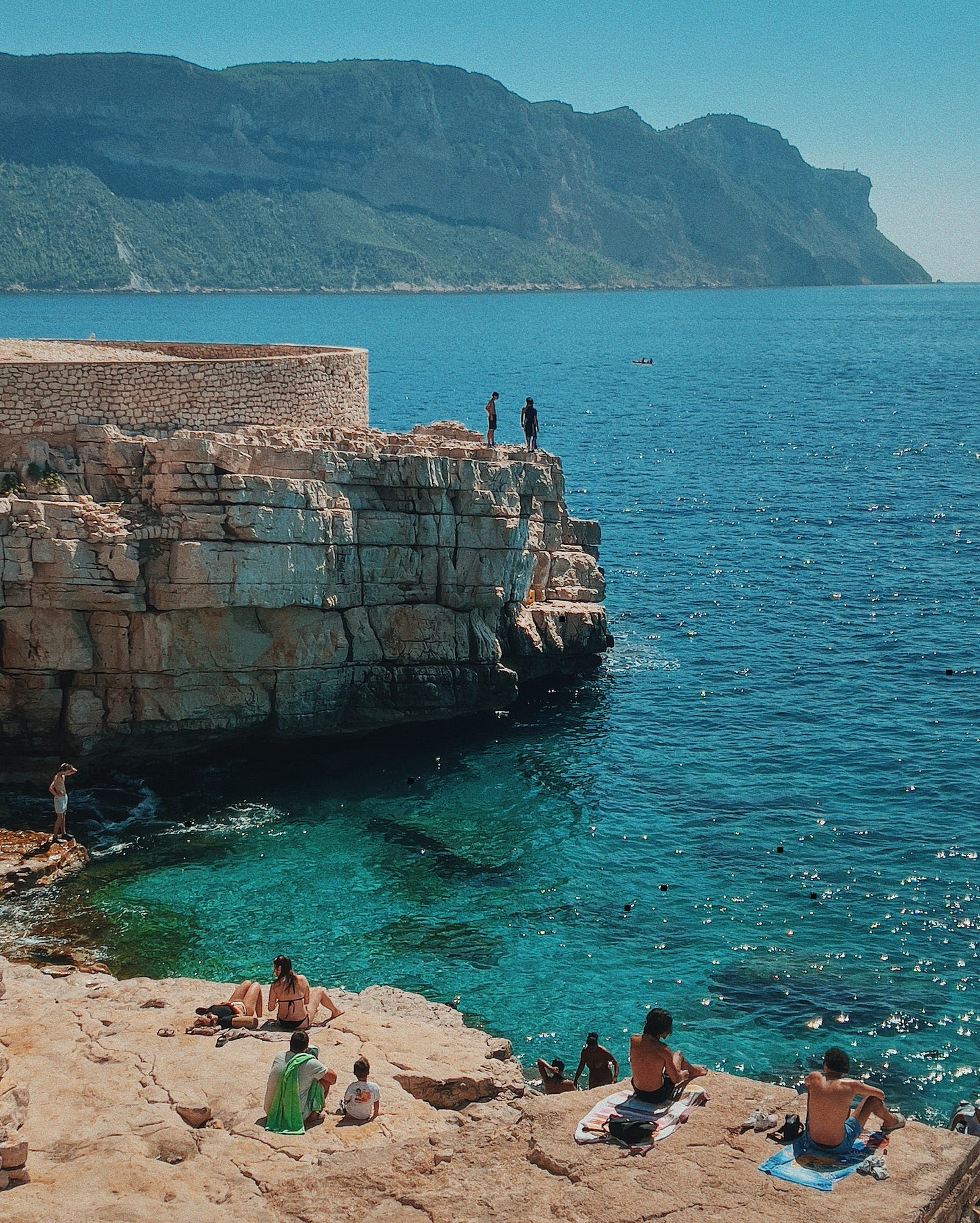
It decided to rain buckets here in Barcelona. All last week, Kyle and I talked about taking a trip out to the beach to capture those final glimmers of summer, naively thinking that summer would still be here, because, it’s not fall yet, right? Fall starts on September 22, that’s what the search results told me, and I should still have weeks and weeks to go to the beach and lie in the sun and swim in the sea. Barcelona woke up this morning and let out a big, “nah gurl,” and pronounced that all the PSL-sucking, cozy sweater loving, leaf-peepers were right. Fall is here.
My love of summer is part of my very being, I was born this way. Astrologically I’m a Leo, so my sign is nourished and fueled by the warmth of the sun (fellow Leos sound off in the comments!), and in the Chinese zodiac I’m a Dog, so my natural environment is napping curled up in the sun, not a care in the world. And the summer symbolizes escape and freedom. Being unencumbered by responsibilities, spending time relaxing and recharging, truly living life in the moment. I fondly remember as a kid scrounging up roly polies in the planter beds in front of the house I lived in with my mom and my grandma and my uncle and creating mazes out of Lego for them to explore with a grassy treat waiting for them at the end. I remember as a teenager driving nowhere in particular in my friend Nick’s champagne colored Honda Accord, all the windows down, singing along to Weezer’s “Say It Ain’t So” at the top of our lungs. Or in the last decade or so, getaways to Palm Springs with friends, BBQ’ing and making Blue Hawaiians, playing unhinged games of Jackbox till late into the night.
Summers are a way of measuring time, a lap around the sun. A culmination. The days are at their longest and we get the most out of our lives. What did you do last summer? No one cares what you did in the fall. But hey, I had a wonderful summer, I’m just sorry that it’s over so quickly. So tell me, how was your summer? Visit any new places, meet any new friends? Maybe you drank a delicious glass of wine or ate a schnitzel the size of your head? I’d love to know, feel free to leave a comment, or email me at thefoxisblack@gmail.com 💙
Now that I’m back in Barcelona I’m working on getting back into my creative rhythm, and I thought it would be interesting to share a recent project where I was asked to develop a cover treatment for a book by an up-and-coming author. Some of you know I love to design book covers as a creative outlet, with a good example being this cover I designed for Dune, so I took this project on with excitement. Sadly, I’m going to skip to the ending here… the project was killed after the second round of creative. There were a few factors involved, like the author not having the clearest vision of what they wanted, and perhaps I didn’t sell my concepts? It’s hard to say. Looking back I’m kicking myself a bit wondering if I could have approached the situation differently. Nonetheless, I was proud of the work I did, so here’s a look at how I design a cover.
For context, the book was about a young man who goes on a journey to find himself, traveling around the world discovering who he is. I was asked to create a cover that was simplistic, with bold typography, pulling inspiration from classic book covers, but with a contemporary feeling. After two rounds of concepts, I ended up creating over two dozen concepts, some permutations, a lot were completely new ideas, which showcased a wide range of what was possible in the hopes of understanding what worked, and what didn’t. Ok, let’s dive in here.
My initial problem to solve was to figuring out how to make all the text elements work together and feel cohesive. There was the title of the book, Sagrada Familia, as well as a subtitle, and the author’s name, which has three names. Above was my first pass, exploring this idea of bold type that would grab someone’s eye. From there, I wanted to explore breaking up the title into smaller pieces because each word has seven letters, which ends up creating a very wide title with a lot of negative space above and below. As you’ll see below this layout had a great flow to it, drawing the eye from the top left and gently gliding it down to the bottom right. I like the mix of monospace typefaces here, with the title in a serif and the authors name and subtitle in a contemporary, chunky sans. I even created a few versions that showed what a photo in the background could potentially look like, just in case it sparked any further ideas. These are all essentially warm-ups.
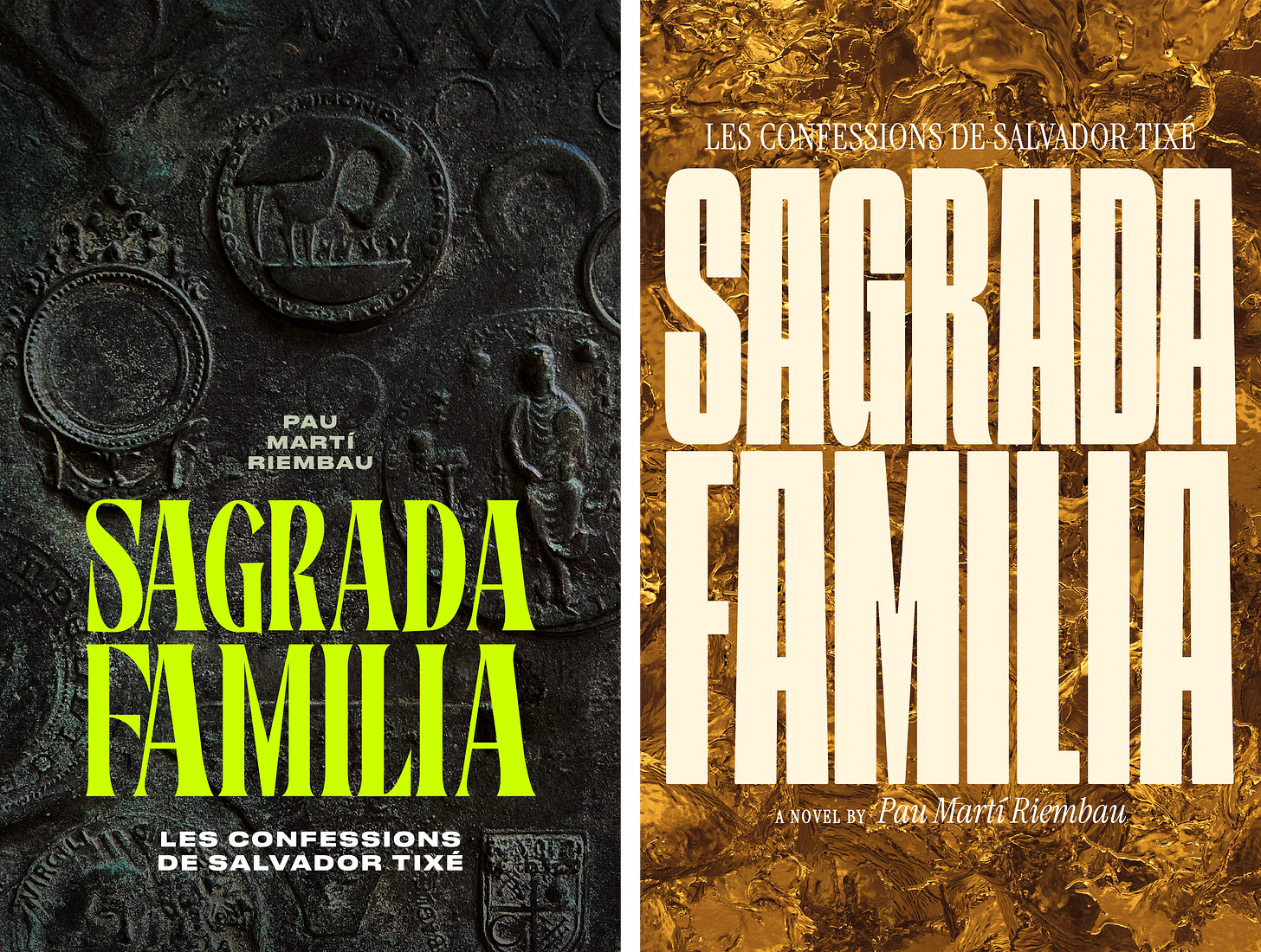
Another direction that was discussed was communicating spirituality. As part of the protagonist’s journey, they experience religion and enlightenment in a number of different forms, so I felt it was worth exploring. The option below on the left is one of my favorite concepts as it combines a lot of different feelings. The image in the background is from a bronze door at the Sagrada Familia and I love how the different symbols and trinkets bring an air of mystery and intrigue to the cover. Then, I paired it with this wild typeface in a neon green color makes for such a dynamic interaction. The concept on the right was spurred from this idea of gold and golden objects used in religion, but taken to an extreme. The typeface is called SCHABO Condensed which I spaced really tightly to create a super bold title. The interplay between the liquid gold and the type makes for a cover that’s so bold that it’s almost overwhelming.
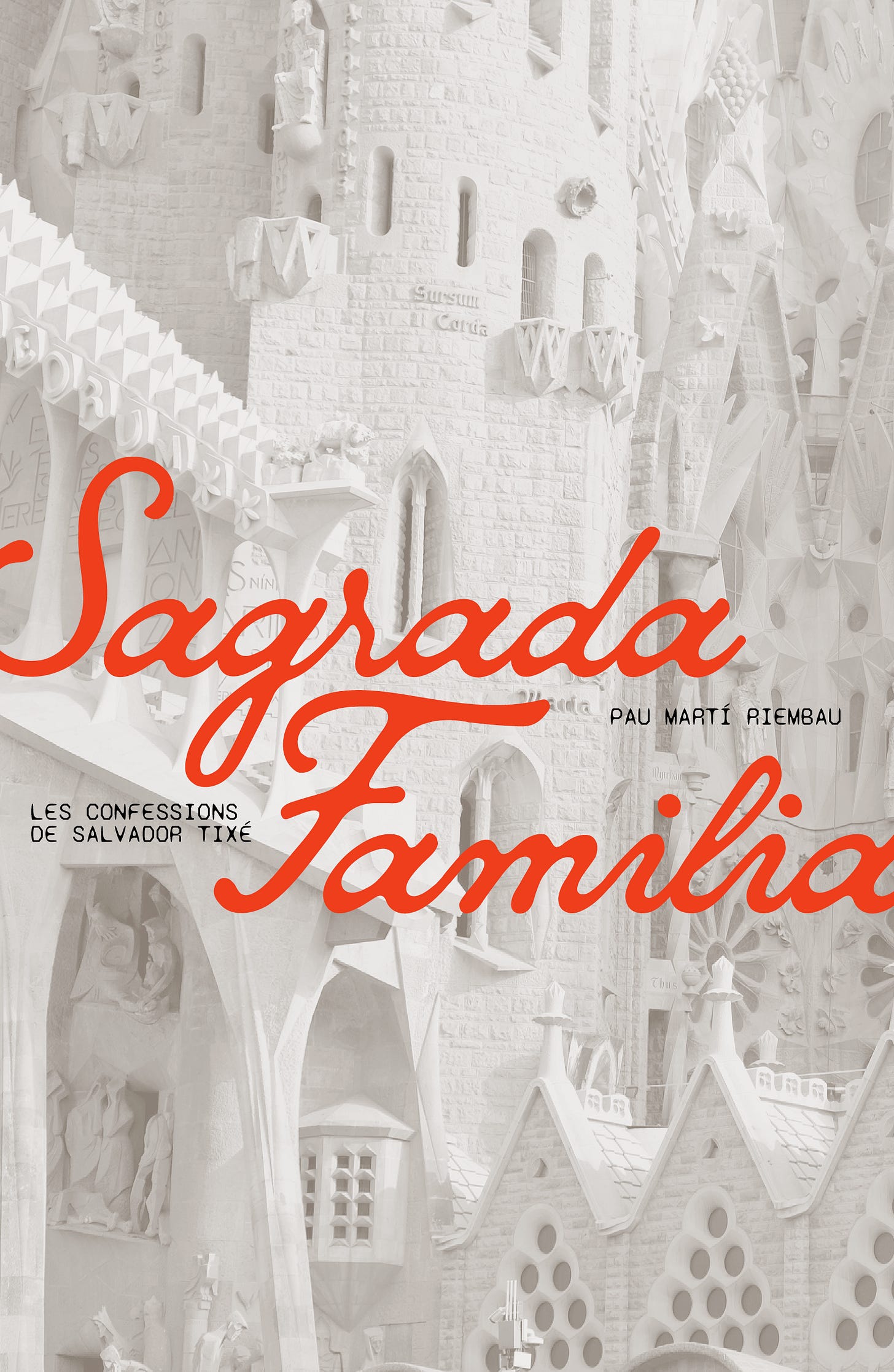
One of the last concepts I created for the first round of explorations was, in my opinion, a solution that is visually striking but also extremely simple. I found this beautiful image of the exterior of the Sagrada Familia that was shot in a low contrast, which I used to my advantage, washing it out even further, to create a richly detailed background that is unique but let’s the title take the center stage. The typeface is called Luminaire Script, and I loved how the two words in the title fit together so nicely, it felt quite serendipitous. I love how elegant and dynamic this feels, and I like how it pairs with the chiseled looking monospace typeface for the author name and subtitle. I can’t tell you how many times I scooted all of these elements around to make sure there weren’t any weird tangents and for all the elements to work just so.
There were a few more ideas I didn’t share, though essentially, that was round one of my explorations. When I present ideas I find it’s important to have a broad range of concepts which helps me understand what is and what isn’t working. At this point I created a Google Slides presentation (happy to share if you’re curious), walked the client through all the ideas, and then asked for feedback so I understood which direction they were feeling. They got back to me promptly, and I started on round two.
Generally, they preferred the more simple executions, bold text for the title, with the subtitle sat between it, so that it would be read more as a cohesive whole. They also liked the idea of having a sunburst as a visual element as well, as well as utilizing a golden yellow color. This provided a new challenge because Sagrada Família needs to have an accent over the “I,” something that wasn’t initially mentioned. As you’ll see below, making all the type fit together is… challenging. The accent gets lost or gets in the way, though as you’ll see in the bottom right concept, I was able to split up the subtitle to make it work a little better. Honestly, I wasn’t feeling any of the concepts below and I felt like I was in a bit of a rut. None of them grabbed me, none of them said anything, or gave any insight into what this story was about.
Nonetheless, I kept going, and I ended up with the version below, which I felt was very successful. The typeface is called Lauge, which is inspired by old danish type and old museum posters from the 30s. I liked it because it has really interesting proportions as well as a nice boldness that really makes the title pop. The position of the “I” with it’s accent was also really helpful, allowing me to split the subtitle up and everything still felt centered and proportional. Adding in a little bit of a texture gave the cover a bit of “tooth” and texture that I felt the other covers were lacking. Is this the most exciting cover ever? No, but I felt like it fit the brief, and I wasn’t made about it. Still, I kept exploring, wanting to be sure that I was able to show a full breadth of what was possible for the cover.
What I wanted to explore further was integrating imagery to see how it could change the tone of the cover. Bringing in themes and tones from the outline, I felt like bringing in a face, having that presence of a person, could draw people in. I think of covers with people, a person looking at you, or even just being present on the cover, gives some context or familiarity that can be helpful. I was able to find some beautiful images, the two below my favorites, that I felt really lent a sense of intrigue to the covers. The one below on the left had that spiritual nature that I mentioned before. Is he in agony or ecstasy? Alive or dead? It makes me want to know more. Now, the concept below on the right was… out there. When I found this photo I knew I had to try it. It’s tonally very different from all the other work. But as I explored, I kept thinking about how this book cover would look sitting in a store, on a newsstand, or as a tiny thumbnail online. And this cover, with it’s bold cover and moody lighting, would absolutely grab my attention.
Finally, in the spirit of trying a couple more ideas that are left of center, I went in a direction that was more clean and modern, an approach I hadn’t quite tried yet. I decided the best way to go was to use Inter for it’s flexibility and readability. It’s a modern classic that works for so many applications and I love how the letters and words came together so cleanly. And though I used similar type treatments, I wanted to present two very different flavors. The concept below on the left is a bit more modernist, with some bright colors and abstract shapes that speak to being carried on the wind, the protagonist on their adventure. While the concept on the bottom right was inspired by Dutch or Danish cool girls. Minimalism and odd color choices, an interesting and dynamic texture, all coming together to feel timeless and classic. I think these are successful in a very different way, and honestly, I think the concept on the right is maybe one of my favorites of all.
So yeah, it was a bummer that the project was killed. I stand by the work, and honestly, the client was effusive with praise as well, but it didn’t work out. I’ve used it as a learning experience, it’s all I can do really. But I couldn’t let all this work go to waste, and so, here it all is. I don’t usually share my personal or professional creative work, which is so funny, because I’m good at sharing the work of others, but horrible about hyping myself up. Hopefully this has been interesting or educational! If you have any thoughts or feedback or questions I’m happy to answer, and if you’re interested in seeing more projects like these, please let me know!


Loved seeing your book cover process! Can totally relate about working through many concepts to help yourself see what's working and what's not working. So many ways to express a book's message it can really take time to distill that down into a visual that will be evocative enough for someone to pickup off the shelf! A little bit of a dark art. Thanks so much for sharing.
I loved seeing your design process! There were so many cool iterations.