


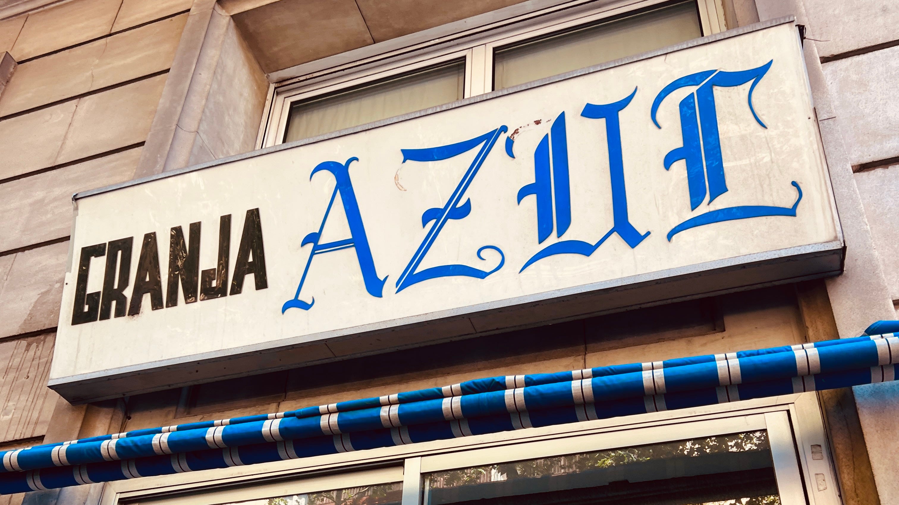
No Password Tomorrow
Canned fish branding, drippy lava candles, a beast of a typeface and more

You’ve heard from me quite a lot in the last week so I’m keeping today’s newsletter a light but robust, like a peppery arugula salad topped with burrata. I put out a new mix on Saturday focused on queer electronic artists, which I think is super fun, and you can access all the other mixes I’ve made this year by visiting here. I’m also posting on TikTok quite regularly so follow me over there if you haven’t yet. I have lots of thoughts and feelings about the process, why TikTok and more, which I’ll be sharing next week.
Hope your week is chill and lovely. It’s finally feeling like spring spring here in Barcelona, it’s been wonderful (though we had some crazy rain and lightning over the weekend!) — See you next week 💙

👛 — Lovely bit of branding by Ollie Schaich for Mano Espresso Bar, a coffee shop in Switzerland. I think the tooth of the wordmark, that heavily distressed, tightly kerned feeling, gives it a bold presence while still maintaining just enough legibility. And the pink, in contrast to the muted tones of the shop itself, works incredibly well.

🕯️ — Things I love, candles and drippy lava glaze! It’s like Mathieu Blazy, creative director of Bottega Veneta, set out to make literally the perfect looking candle for me. These Glaze Candles come in three unique “flavors,” the yellow is a “blends incense, suede rose, and vetiver,” the green is “fig, aromatic thyme, and lavender,” and the red one smelling of “plum nectar, tobacco, and cedarwood to create a rich, leathery scent.” I’m all about fig scents so that green one sounds like heaven to me. Now, if they were only like, a quarter of the price… 😓

🪨 — My first reaction the image above was, “what the heck is this made of?” This is a credenza built out at Otonali, a minimalist izakaya-style restaurant located in Saint-Malo, France. The architects, Marsollier Villacorta, intended it as a focal point to the dining room, and to me, the material instantly draws me in. Can you guess what it is? If you managed to figure out that it’s made from locally quarried granite, congrats, you win a prize!

🎶 — There are only a hand full of indie record labels that I follow closely, anticipating their releases. One such is Konkyō Records, a record store in Japan that has put out their newest release, Music for Resorts. The compilation was created to “bring attention to the current situation where beautiful scenery and places are being lost. The irreplaceable scenery and nature of our hometowns that we all have in our hearts is a resort for someone and a place that enriches people's hearts.” A love compilation, very highly recommended.

🔤 — As they say, the proof is in the pudding, and this can’t be more true when it comes to typefaces. David Jonathon Ross created a new typeface called Job Clarendon and then worked with Noah Baker to create a series of incredible posters to show the versatility of what you can do with it. The results are phenomenal and you can really get a sense of the versatility.

Spanish fashion and fragrance brand Puig, shepherds of brands like Dries Van Noten and Bryedo, recently went through a thoughtful redesign care of (M/M) Paris. They’ve put together a look at the work into the new identity and I think it’s so interesting, and very Spanish. The swirling, organic mark you see above is so unique and full of life.

Is designing a tinned fish brand the new designing a weed brand? The team at Young Jerks have built out a strong brand identity for Alaska-based Wildfish Cannery. They’ve done a couple smart things here: 1) Utilizing red, white, and yellow for brand colors, eschewing the typical “water” palette, 2) that “W” mark made up of the two salmons! It’s so clever, I absolutely love it.