The State of Design, In Four Parts
This past week saw Pentagram use AI, Jaguar reveal its “car,” Pantone drop a gloopy color, and Spotify Wrapped crashing out. Somehow, it captures what mainstream design is now: soulless.
These last few weeks in the general spheres of creativity have felt like an emotional escape room, with shocks and horrors seemingly coming at us from around every corner with not a moment to breath! We’re talking gaffs, guffaws, and general goopery which makes me question: What is happening with the state of creativity? There were three big things that popped in the mainstream of design culture, and one item I felt like I should follow-up on as it’s too ridiculous not to!
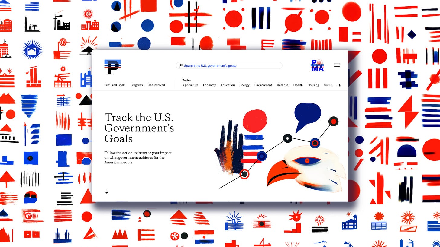
Let’s start out with the big controversy from design firm Pentagram, who this week released a new project for Performance.gov, a site which documents strategic goals that benefit U.S. citizens. Led by partner Paula Scher, the overall design is quite standard in it’s look and feel but it was the fun fact that they decided to use AI software Midjourney to create a set of 1,500 icons rather than hiring a illustrator to do so. The comments on their post on Instagram sums up the sentiment quite well, a ton of negativity, with a smattering of the usual “AI iS jUsT aNoThEr ToOl” apologists repeating the same tired phrase, “AI is here and you have to get over it.”
Firstly, if you are a creative, AI can make you and your skills obsolete, period . All artificial intelligence is trained on existing data, existing creative on the internet and on social platforms, and the people making AI have no great moral standing to respect your work. Those entities are out to make cold, hard cash the very same way that Pentagram is. Millionaire boomers like Paula Scher and Michael Beirut don’t care about the little guys because they’re at the top of the heap. It’s ironic, on the recently released Creativeboom Hotlist, a list of the 25 most popular design studios as voted for by their peers, Pentagram was voted as number one. It would be quite interesting to see the results after this week…
Additionally, on Pentagram’s website there isn’t a formal case study yet, though they have linked out to a Substack called Designing with AI who goes onto defend the project. Comparing AI to the rise in digital photography, they wrote “when digital photography emerged, it caused an uproar in the world of professional photography. Purists argued that the medium lacked the authenticity and craftsmanship of film.” It’s a cute argument as digital cameras don’t copy the work of millions of existing pieces of creative. No one had to take the equivalent of 1,500 photos to make these illustrations, they input some prompts and got back tons of options to sift through. The piece continues in describing Annie Leibovitz’s journey into digital photography, who to me is a very funny example, as she’s been widely criticied for taking unflattering photos of black women. So far everything has come off as defensive rather than trying to own up to their error in judgement.
Secondly, I find it so curious that a website needed a vast library of 1,500 icons, as it’s such a specific number. Some further context:
She (Paula Scher) argues that 1,000+ government-approved icons, necessary to make the scheme work, would have been impossible given Pentagram’s three-month, five designer window on the project (plus another three months unpaid). “My argument about this, and where the differential is, is that the definition of design in the dictionary is ‘a plan’,” says Scher. “We created a plan, and it was based around the fact that this would be self-sustaining, and therefore was not a job for an illustrator… We will use the best tools available to us to accomplish the ideas we have.”
It’s unhinged that she cites the definition of design as her excuse! It’s fascinating to see a boomer explaining to the plebes how they don’t get it! But, it begs the question, why so many icons? Who decided this? This small, government website that may have only received thousands of page views if weren’t for this scandal? I think it’s a cop out, a way to excuse the use of AI because of this made up number, and thus, opening the door for Pentagram’s continued use of AI while abandoning the practice of working with real people with valuable skills.
I’ve seen so many comments which are surmised as saying, “Well, if Pentagram, the biggest design agency in the world can do, why can’t I?” This hits at the heart of the issue. I fear and suspect we’re entering into a “me first” era more generally, doing what needs to be done by any means necessary in order to survive. It all comes down to money, and again, capitalism warping what creativity looks like. (It also reminds of how sociologist Tressie McMillan Cottom explained how schools shifted from being anti-AI to pivoting to embrace it: it’s all about the money, which builds political clout.) Scher, sitting in her Flatiorn apartment, will continue to live her prosperous life, and those without budgets or talents will use AI to “create” things beyond their means as a way of making do. AI is inevitable because it’s cheap and easy. But there is a bifurcation occurring made up of those who appreciate people for their skills, and those who comprise the Idiocracy, who love buying things and being entertained.
Which dovetails us nicely to an update on the whole Jaguar rebranding debacle. Turns out they were 100% serious in their ridiculous efforts, the Candyland hellscape they envisioned was entirely purposeful, and they unveiled their new concept car at Design Miami with a bunch of c-list celebs and influencers, along with Skepta, who hopefully got a nice fat check out of the deal. The Type 00 as they’ve called it, is truly only a concept, as it would be impossible to see out any of the windows and it has no side mirrors whatsoever. I’ve seen Art Center graduate projects better thought out than this! Oh well, enough time and energy spent on these bone heads, let’s chat chocolate!
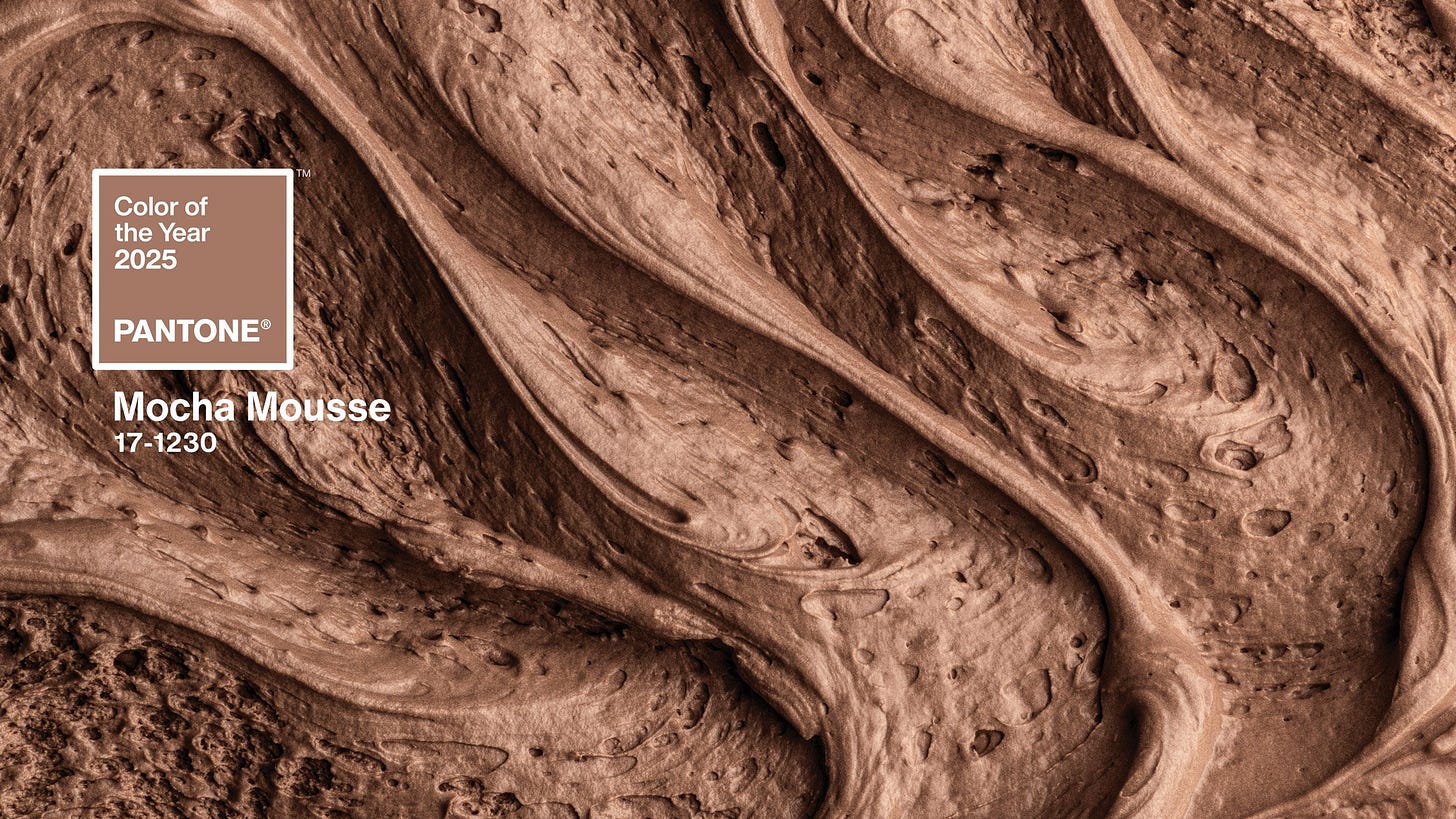
Pantone has announced their color of the year, marketing it as “Mocha Mousse,” and again I feel like a crazy person as this is so stupid. I don’t hate the color, the first OÍR cover I designed last January has a similar hue, though my friend Lindsay Miller accurately described it as “the color of a raggedy Ace bandage” which I cannot stop laughing about. Let’s be clear that Pantone is not here setting any trends. They have a great PR team and this yearly release is a great way for websites to get those ad impressions. They make money off of cheap merch which makes people feel “artsy” thanks to a colorful mug or notebook. This has been your annual reminder to not buy into the hype, that Pantone now sells the idea of design more than actual color theories.
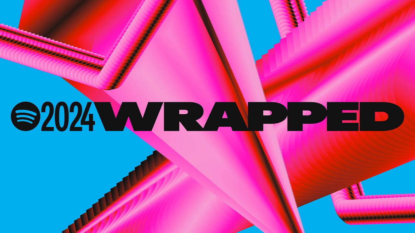
Finally, the final train wreck of the week was the release of Spotify’s Wrapped for 2024, which Kyle accurately described as feeling “hollow because it was a manifesting of demure bratty brain rot enshittification mindset.” Over on It’s Nice That, the design site spoke with Rasmus Wängelin, Spotify’s global head of brand design, who described the wannabe edgy look and feel for 2024, saying, “I’m excited about how we’ve managed to dial up the design like never before. This year we’re playing at full volume.” Oof! A bad pun to describe a bunch of mundanely designed templates that looks like a poorly conceived DVD player screensaver. The kids love nostalgia! Sadly, the quippy PR team written one-liners don’t stop there:
These new logos celebrate the rise of new and surprising genres, breakthrough female pop stars, and chart-topping hits. This set the stage for Wrapped and hyped fans for what was to come, showcasing how much influence Spotify fans have on culture. Because when they listen, culture shifts.
A dynamic blend of vibrant gradients and solid colours, playful layouts, and spirited animations breathe life into the design, reflecting the energy of this unique moment in time.
2024 Spotify Wrapped is bigger and bolder than ever before.
Siggggggghhhhhhh. Unsurprisingly, this all has fallen flat for people, which loops us back to the beginning: the design played a role, yes, but it was the role of AI that caused the most eye rolling.
…and that’s all the big design news this week! I would love your genuine thoughts and feelings on the above, in the comments or via email. Am I wrong in feeling crazy about all of this? I have more to say on AI, it was actually a convo I had with a friend recently over on Instagram, someone who I do think is doing interesting things with AI, but the use cases are very different. I think I’ll try to see if he wants to do an interview, I think it would provide an extremely unique perspective to the conversation.
Anyhow, I feel exhausted. I’m now going to bake a delicious onion tart to help melt away the winter weather that has descended upon Barcelona currently. Hope your week is lovely 💙
Current Listening 🎶
Lyo XS - Lapi + Filia Music Series 016


Spot on critique of Pentagram's use of AI. Also one of the reasons Spotify Wrapped sucked this year is that last year they laid off Glenn McDonald, the engineer/data scientist at the helm of the Wrapped project team - he had some things to say about it! https://bsky.app/profile/glennmcdonald.bsky.social/post/3lcipa5bgmc2w
The AI chat is getting interesting! Reminds me of the launch of a recent "tool" for naming brands – caused a big stir at the agency I was at at the time. Seems they also try to justify the use of AI by citing trademark and copyrights while ignoring the nuance that comes behind human naming/copywriting. Fascinating and sad